Create a Horizontal Mobile Scroll Box Using CSS Flexbox and Media Query
by Bennett Dungan
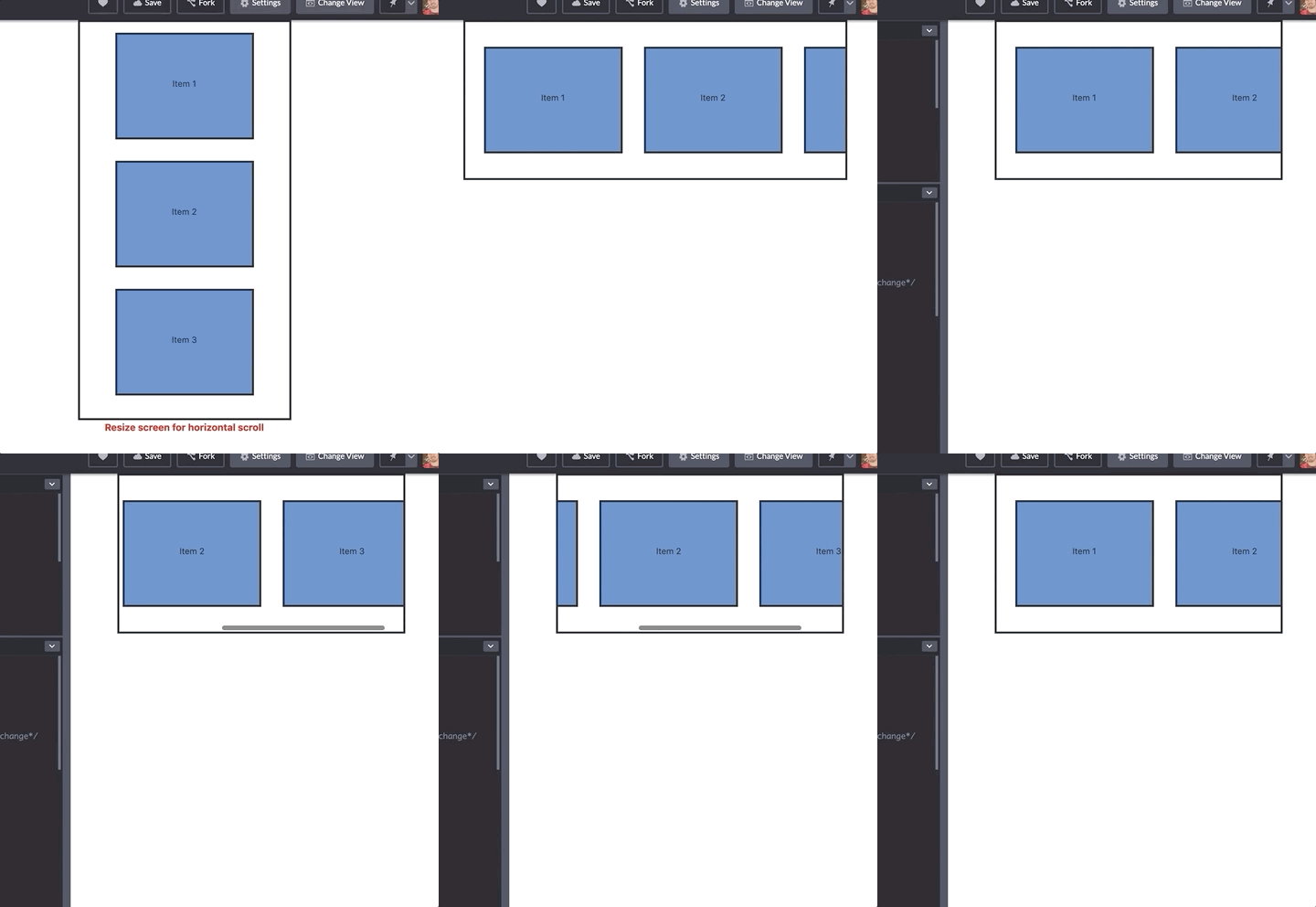
I had the chance to flex my CSS chops recently, which turned out to be pretty weak, but I learned a few cool things along the way. I was tasked to create a vertical list that transforms to horizontal scrolling when sized down to mobile. This was the outcome:

The two main takeaways from this came from using CSS's media queries and flexbox. I had only done some real quick and dirty CSS styling in the past so this was my first exposure to both of these two tools. I whipped up this simple Codepen version of the above where you can see the vertical to horizontal list and scroll in action. The majority of the magic comes from this little chunk of CSS:
  .container {

    display: flex;

    flex-wrap: nowrap;

    height: 300px;

    overflow-x: auto;

    width: auto;

  }
The first thing you'll notice is that @media rule which is how Im telling the div with all the items to apply the subsequent CSS properties to the .container class. To put it simply, when the screen size hits 992px or lower, the .container class now changes/adds the listed properties starting with display: flex .
Next, we're adding flexbox with display: flex and then making sure that the items do not wrap within the container as we scale it down with flex-wrap: nowrap . I changed the height of the container to a more narrow 300px so it creates a mobile-friendly view of the item that scroll.
Sidenote: If you're unfamiliar with Flexbox , I highly recommend doing this interactive learning game: Flexbox Froggy . It teaches you most of the basic and some advanced properties of Flexbox by maneuvering a frog onto its lillypad.
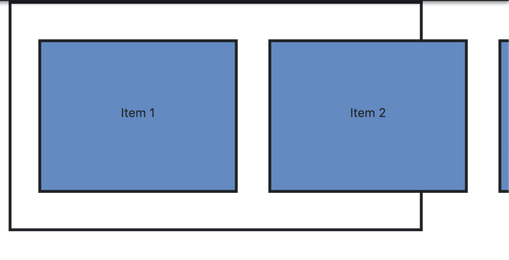
Finally we add overflow-x: auto to allow the items within the container to have scrollable functionality on the X axis when the items spill outside of the parent container. Without this property we'd have something that looks like this:

Once we have all those properties put together, we're left with a nifty little item list that transforms to mobile-friendly horizontal scrolling:

Typically, you're going to be taking a list of items that is horizontal in desktop screen sizes and then scaling it down to a vertical list when hitting mobile screens. So we're essentially forcing the opposite to happen here which isn't too common and why its sometimes hard to find a solution for it on places like Stackoverflow.
Hopefully you found this useful. If you know of a better way or some clever little tricks I missed please be sure to let me know!